Flutter exporter
Export VibeIRL tokens, components, and mobile screens into Flutter-ready code.
This page turns the current VibeIRL glass system into Dart theme files, reusable widgets, Explore screen examples, and a Flutter-specific handoff document. The generator follows the existing design philosophy, token map, mobile heuristics, and engineering notes already documented elsewhere in the stylizer.
Theme tokens
11 groups
Components
9 widgets
Mobile screens
2 variants
Export modes
10 outputs
Export options
Choose what Flutter engineers need next.
Exports always pull from the live stylizer draft so theme adjustments, glow tuning, and accent swaps translate directly into Dart output.
Mobile mode
The toggle updates Explore screen exports and the mobile preview stack below.
Compatibility
Targets Flutter 3.7.12 and Dart 2.19.6 with a compatibility-safe InheritedNotifier scope.
Current source
Vibe preset
Export follows the active Vibe Layer preset. Change it in Vibe Layer to keep web, Flutter, Markdown, and Figma handoffs synchronized.
Code output
Flutter Theme
Centralized theme/token export for colors, gradients, spacing, typography, glass, and strokes.
import 'dart:ui';
import 'package:flutter/material.dart';

// Generated from the VibeIRL UI Stylizer. Keep these tokens in one place so widgets and screens stay visually aligned.
class VibeColors {
  const VibeColors._();

  static const Color bgBase = const Color(0xFF040713);
  static const Color bgCanvas = const Color(0xFF091126);
  static const Color bgAurora = const Color(0xFF121739);
  static const Color bgHaze = const Color(0xFF0E2244);

  static const Color textPrimary = const Color(0xFFF7F8FF);
  static const Color textSecondary = const Color(0xFFD2DCFF);
  static const Color textTertiary = const Color(0xFF9DB1E5);
  static const Color textMuted = const Color(0xFF7087B6);
  static const Color textIcon = const Color(0xFFE5ECFF);

  static const Color accentPink = const Color(0xFFFF56D6);
  static const Color accentCyan = const Color(0xFF46E3FF);
  static const Color accentGold = const Color(0xFFFFD166);
  static const Color accentPurple = const Color(0xFF9A68FF);
  static const Color accentBlue = const Color(0xFF4D82FF);
  static const Color accentGreen = const Color(0xFF32F2A4);

  static const Color success = const Color(0xFF20D68F);
  static const Color warning = const Color(0xFFFFBA57);
  static const Color danger = const Color(0xFFFF657E);
  static const Color info = const Color(0xFF53B7FF);

  static const Color glassFillDark = const Color(0x550B1021);
  static const Color glassFillRaisedDark = const Color(0x6E111936);
  static const Color glassBorderDark = const Color(0x47D8EBFF);
  static const Color glassHighlight = const Color(0x42FFFFFF);

  static const Color lightBackground = const Color(0xFFF7F8FF);
  static const Color lightCanvas = const Color(0xFFEEF2FF);
  static const Color lightSurface = const Color(0xFFFFFFFF);
  static const Color lightBorder = const Color(0xFFC3E7FF);
  static const Color lightLabel = const Color(0xFF9187CA);
}

class VibeGradients {
  const VibeGradients._();

  static const LinearGradient aurora = LinearGradient(
    begin: Alignment.topLeft,
    end: Alignment.bottomRight,
    colors: [
      const Color(0xFFFF4FD8),
      const Color(0xFF9A68FF),
      const Color(0xFF3FE8FF),
      const Color(0xFFFFD166),
    ],
    stops: [0.0, 0.32, 0.64, 1.0],
  );

  static const LinearGradient prism = LinearGradient(
    begin: Alignment.topLeft,
    end: Alignment.bottomRight,
    colors: [
      const Color(0xFF32F2A4),
      const Color(0xFF3FE8FF),
      const Color(0xFF4D82FF),
      const Color(0xFF9A68FF),
    ],
    stops: [0.0, 0.34, 0.68, 1.0],
  );

  static const LinearGradient neonBeam = LinearGradient(
    begin: Alignment.centerLeft,
    end: Alignment.centerRight,
    colors: [
      const Color(0xFFFF56D6),
      const Color(0xFF46E3FF),
      const Color(0xFFFFD166),
    ],
    stops: [0.0, 0.48, 1.0],
  );

  static const SweepGradient strokeLoop = SweepGradient(
    startAngle: 0.0,
    endAngle: 6.28318,
    colors: [
      const Color(0xFFFF56D6),
      const Color(0xFFB191E7),
      const Color(0xFF46E3FF),
      const Color(0xFF7ADED4),
      const Color(0xFFFFD166),
      const Color(0xFFFF56D6),
    ],
    stops: [0.0, 0.22, 0.46, 0.72, 0.92, 1.0],
  );

  static const RadialGradient glassWash = RadialGradient(
    center: Alignment.topLeft,
    radius: 1.2,
    colors: [
      const Color(0x38FF56D6),
      const Color(0x2446E3FF),
      const Color(0x14FFD166),
      const Color(0x00040713),
    ],
    stops: [0.0, 0.36, 0.72, 1.0],
  );
}

class VibeRadii {
  const VibeRadii._();

  static const double xs = 14.0;
  static const double sm = 20.0;
  static const double md = 20.0;
  static const double lg = 28.0;
  static const double xl = 36.0;
  static const double pill = 999.0;

  static BorderRadius get card => BorderRadius.circular(lg);
  static BorderRadius get chip => BorderRadius.circular(pill);
}

class VibeSpacing {
  const VibeSpacing._();

  static const double xxs = 4.0;
  static const double xs = 8.0;
  static const double sm = 12.0;
  static const double md = 16.0;
  static const double lg = 24.0;
  static const double xl = 32.0;
  static const double xxl = 48.0;
}

class VibeTypography {
  const VibeTypography._();

  static const String displayFamily = 'var(--font-display-loaded)';
  static const String bodyFamily = 'var(--font-body-loaded)';
  static const String monoFamily = 'var(--font-mono-loaded)';

  static const TextStyle hero = TextStyle(
    fontFamily: displayFamily,
    fontSize: 40,
    fontWeight: FontWeight.w700,
    height: 1.05,
    color: VibeColors.textPrimary,
  );

  static const TextStyle sectionTitle = TextStyle(
    fontFamily: displayFamily,
    fontSize: 22,
    fontWeight: FontWeight.w600,
    color: VibeColors.textPrimary,
  );

  static const TextStyle cardTitle = TextStyle(
    fontFamily: displayFamily,
    fontSize: 18,
    fontWeight: FontWeight.w600,
    color: VibeColors.textPrimary,
  );

  static const TextStyle body = TextStyle(
    fontFamily: bodyFamily,
    fontSize: 16,
    height: 1.45,
    color: VibeColors.textSecondary,
  );

  static const TextStyle meta = TextStyle(
    fontFamily: bodyFamily,
    fontSize: 13,
    height: 1.35,
    color: VibeColors.textTertiary,
  );

  static const TextStyle eyebrow = TextStyle(
    fontFamily: displayFamily,
    fontSize: 12,
    fontWeight: FontWeight.w500,
    letterSpacing: 2.2,
    color: VibeColors.textTertiary,
  );
}

class VibeShadows {
  const VibeShadows._();

  static const List<BoxShadow> panel = [
    BoxShadow(
      color: Color(0x7A020510),
      blurRadius: 54,
      offset: Offset(0, 22),
    ),
    BoxShadow(
      color: Color(0x3D020510),
      blurRadius: 22,
      offset: Offset(0, 8),
    ),
  ];

  static const List<BoxShadow> bloom = [
    BoxShadow(
      color: const Color(0x2E46E3FF),
      blurRadius: 52.8,
      spreadRadius: 0,
    ),
    BoxShadow(
      color: const Color(0x29FF56D6),
      blurRadius: 36.96,
      spreadRadius: 0,
    ),
  ];

  static List<BoxShadow> strokeGlow({Color? color}) => [
        BoxShadow(
          color: (color ?? VibeColors.accentCyan).withOpacity(0.14),
          blurRadius: 42.0,
          spreadRadius: 0.7,
        ),
      ];
}

class VibeGlassTokens {
  const VibeGlassTokens._();

  static const double blurSigma = 22.0;
  static const double surfaceOpacity = 0.4;
  static const double tintStrength = 0.24;
  static const double highlightStrength = 0.54;
  static const double panelRadius = 28.0;

  static BoxDecoration surface({required bool dark}) {
    return BoxDecoration(
      borderRadius: VibeRadii.card,
      gradient: dark
          ? LinearGradient(
              begin: Alignment.topLeft,
              end: Alignment.bottomRight,
              colors: [
                VibeColors.glassFillRaisedDark,
                VibeColors.glassFillDark,
              ],
            )
          : LinearGradient(
              begin: Alignment.topLeft,
              end: Alignment.bottomRight,
              colors: [
                VibeColors.lightSurface.withOpacity(0.94),
                VibeColors.lightCanvas.withOpacity(0.9),
              ],
            ),
      border: Border.all(
        color: dark ? VibeColors.glassBorderDark : VibeColors.lightBorder,
        width: 1.4,
      ),
      boxShadow: [
        ...VibeShadows.panel,
        ...VibeShadows.bloom,
      ],
    );
  }
}

class VibeStrokeTokens {
  const VibeStrokeTokens._();

  static const double width = 1.4;
  static const double glowIntensity = 0.62;
  static const double glowRadius = 42.0;
  static const double strokeVisibility = 0.76;
  static const double sweepDurationSeconds = 3.38;
  static const double orbitDurationSeconds = 6.86;

  static const List<Color> colors = [
    const Color(0xFFFF56D6),
    const Color(0xFFB191E7),
    const Color(0xFF46E3FF),
    const Color(0xFF7ADED4),
    const Color(0xFFFFD166),
  ];
}

class VibeTheme {
  const VibeTheme._();

  static ThemeData dark() {
    final colorScheme = ColorScheme.fromSeed(
      brightness: Brightness.dark,
      seedColor: VibeColors.accentPink,
      primary: VibeColors.accentPink,
      secondary: VibeColors.accentCyan,
      tertiary: VibeColors.accentGold,
      background: VibeColors.bgBase,
      surface: VibeColors.bgCanvas,
    );

    return ThemeData(
      useMaterial3: true,
      brightness: Brightness.dark,
      colorScheme: colorScheme,
      scaffoldBackgroundColor: VibeColors.bgBase,
      fontFamily: VibeTypography.bodyFamily,
      textTheme: const TextTheme(
        displaySmall: VibeTypography.hero,
        headlineSmall: VibeTypography.sectionTitle,
        titleMedium: VibeTypography.cardTitle,
        bodyMedium: VibeTypography.body,
        labelSmall: VibeTypography.meta,
      ),
    );
  }

  static ThemeData light() {
    final colorScheme = ColorScheme.fromSeed(
      brightness: Brightness.light,
      seedColor: VibeColors.accentPink,
      primary: VibeColors.accentPink,
      secondary: VibeColors.accentCyan,
      tertiary: VibeColors.accentGold,
      background: VibeColors.lightBackground,
      surface: VibeColors.lightSurface,
    );

    return ThemeData(
      useMaterial3: true,
      brightness: Brightness.light,
      colorScheme: colorScheme,
      scaffoldBackgroundColor: VibeColors.lightBackground,
      fontFamily: VibeTypography.bodyFamily,
      textTheme: const TextTheme(
        displaySmall: TextStyle(
          fontFamily: VibeTypography.displayFamily,
          fontSize: 40,
          fontWeight: FontWeight.w700,
          color: Color(0xFF101B49),
        ),
        headlineSmall: TextStyle(
          fontFamily: VibeTypography.displayFamily,
          fontSize: 22,
          fontWeight: FontWeight.w600,
          color: Color(0xFF172556),
        ),
        titleMedium: TextStyle(
          fontFamily: VibeTypography.displayFamily,
          fontSize: 18,
          fontWeight: FontWeight.w600,
          color: Color(0xFF172556),
        ),
        bodyMedium: TextStyle(
          fontFamily: VibeTypography.bodyFamily,
          fontSize: 16,
          height: 1.45,
          color: Color(0xFF465686),
        ),
      ),
    );
  }
}
Feature selection
Choose individual files or take the complete modular kit.
Each file has a stable destination path. The selected download preserves that folder structure inside a ZIP, while the full kit includes the theme, Vibe runtime, glass, stroke, components, screens, README, and assets snippet.
1. Place files
Extract the ZIP so lib/vibeirl_ui keeps the generated folder structure.
2. Add assets
Merge pubspec_assets_snippet.yaml into the host app and add the documented local images.
3. Wrap the app
Create a VibeController and place VibeScope above MaterialApp or the feature shell.
4. Switch state
Call setMood and setBrightness; Vibe-aware widgets update through the inherited notifier.
Theme token export
Map web tokens into Flutter-native values.
The theme export packages VibeIRL colors, gradients, radii, spacing, typography, glass surfaces, shadows, and stroke logic into a readable `vibe_theme.dart` file.
VibeColors
Background, glass, text, accent, and status colors translated into Flutter `Color` values.
VibeGradients
Aurora, prism, neon beam, stroke loop, and glass wash recipes mapped to Flutter gradients.
VibeGlassTokens
Blur sigma, opacity, tint strength, border weights, and glass surface decoration helpers.
VibeStrokeTokens
Stroke width, visibility, glow intensity, glow radius, and motion timing for gradient edges.
Component export
Reusable widget recipes for the VibeIRL library.
These widgets mirror the current design-system primitives and mobile content modules so engineers can lift the exported code into a Flutter package or feature branch with minimal rewriting.
VibeGlassCard
vibe_components.dartFrosted card primitive with blur, border, bloom, and padding hooks.
VibeButton
vibe_components.dartGradient CTA with optional icon and soft beam glow.
VibePillTab
vibe_components.dartSegmented tab recipe for All / Events / Places / Groups.
VibeBottomNav
vibe_components.dartFrosted bottom navigation for Discover, Events, Saved, and Profile.
VibeEventCard
vibe_components.dartFeatured Today hero card with media, badge, metadata, and avatar stack.
VibeListTile
vibe_components.dartNear You and Saved list rows with media, metadata, and trailing actions.
VibeAvatarStack
vibe_components.dartOverlapping attendee stack for social proof and activity density.
VibeIconButton
vibe_components.dartSearch, filter, favorite, and plus actions in soft glass shells.
VibeStrokeContainer
vibe_components.dartReusable glow/stroke wrapper for glass surfaces and highlighted edges.
Mobile screen export
Explore screen exports tuned for dark and light mobile variants.
The reference cards below keep the same structure as the provided Explore screenshots while the Dart generator swaps the underlying theme, surfaces, and motion treatment for Flutter.
Explore / Dark
vibe_explore_dark.dart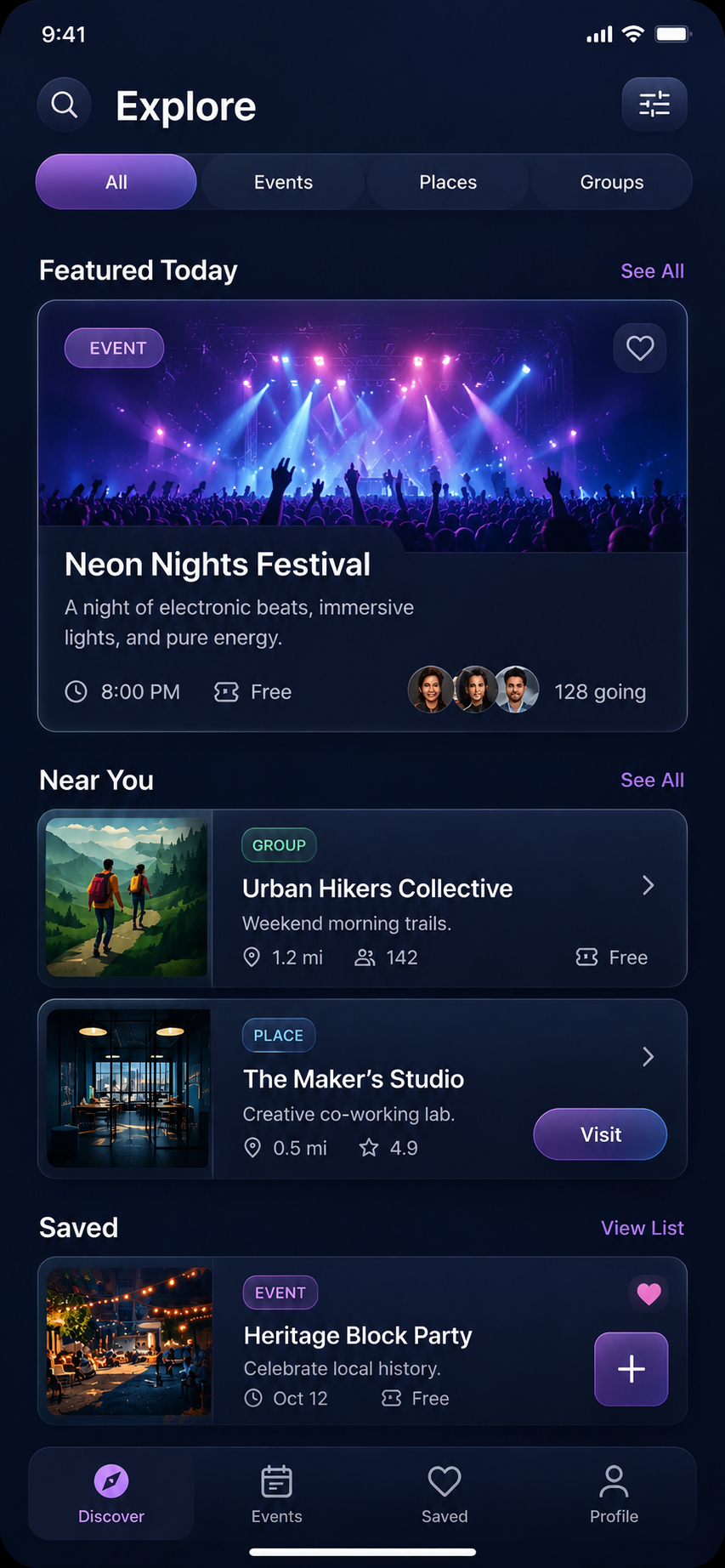
Static reference plus a dedicated live HTML screen for hover, scroll, and interaction testing.
OpenExplore / Light
vibe_explore_light.dart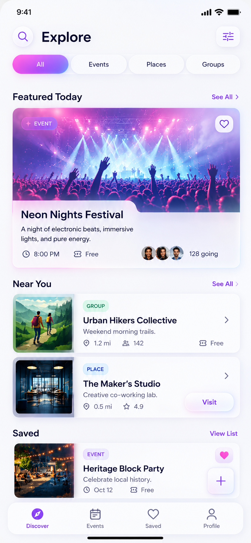
Live variant mirrors the same structure with bright glass cards, softer borders, and readable hover states.
OpenPlaceholder asset mapping
The generated Explore screen expects a small starter asset set. The live HTML preview uses the local image stand-ins below, while the Flutter files reference clear placeholder asset names.
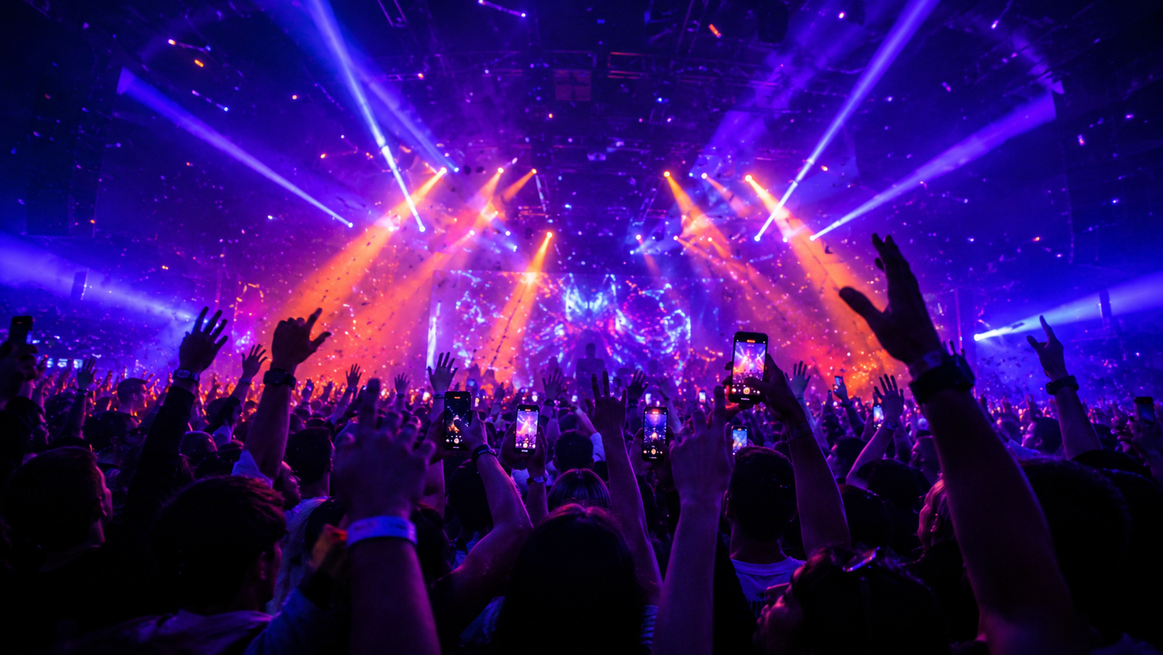
Featured event
assets/images/event_neon_festival.jpg

Near You / group
assets/images/hikers_group.jpg
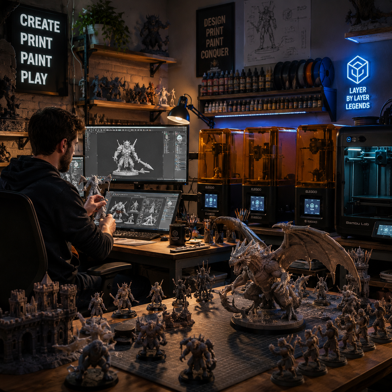
Near You / place
assets/images/makers_studio.jpg
Theme routing
The dark screen keeps a midnight shell with restrained border glow. The light screen uses airy white surfaces, softer shadows, and a pink-cyan active tab treatment so Flutter engineers can compare the two target modes without redesigning the layout.
Developer notes
Practical guidance for Flutter teams adopting the VibeIRL kit.
Use the generated code as a production-readable starting point. Promote shared values into your app-level design system package before spreading one-off theme forks across features.
Source of truth
This exporter uses the live VibeIRL token system plus the current stylizer draft, then remaps that data into Flutter-friendly values and widget recipes.
Known Flutter differences
Backdrop blur, animated strokes, and ambient backgrounds do not map one-to-one from web CSS. The exports choose the closest readable Flutter equivalent and annotate that where needed.
Asset placeholders
The Explore screen exports compile with placeholder `assets/images/*` paths so mobile engineers can swap production assets without rewriting layout code.